Biscuit Bitch
Branding | Packaging | UX/UI
Biscuit Bitch is a Seattle-based hole-in-the-wall brunch spot that offers southern fixins and kick-ass espresso. The goal was to create an identity that reflects the brand’s unapologetic personality combined with a modern and slightly more professional approach and to create an app that allows users to order food with ease and gives them the initiative to return.


When the user logs in, they are brought to the homepage, which is also the menu. The user can look at the featured items and everything else available to order.
To avoid overloading the customer with information, they can only see the name, price, and image of each dish. Still, they can read about what is included when viewing the individual item selected.
Home Screen
Once the user chooses which item they want to order, they can click on it on the home screen, which triggers a pop-up of the item to appear. This allows the user to quickly add an item to the cart without losing their spot in the app.
After adding an item to the cart, the user will always be able to see how many items are in the cart via the hot bar.
Add Item
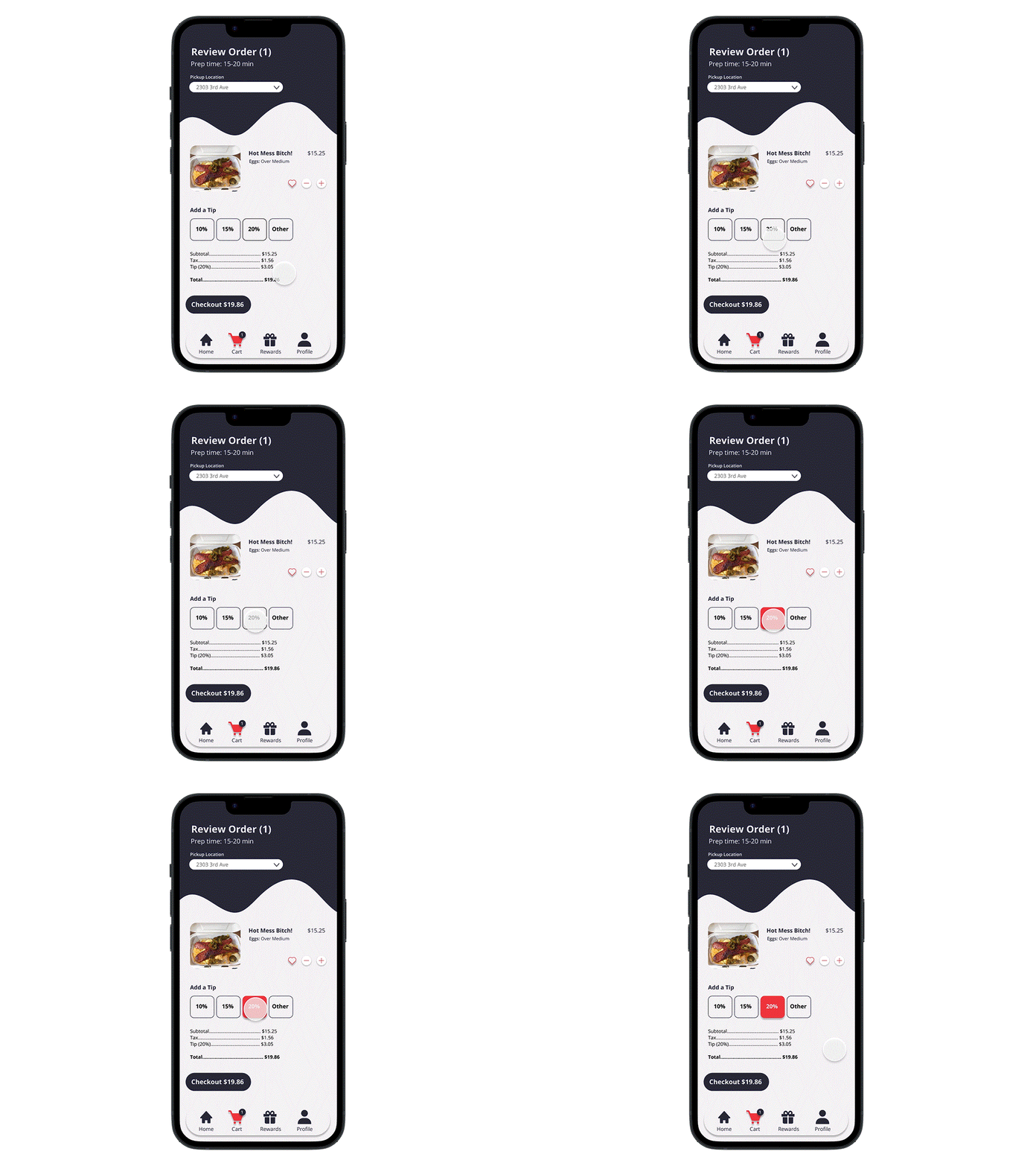
When checking out, the user can view and/or change their pickup location and the estimated prep time for their order which alleviates the wait time at the actual pick-up location.
The user can also add a tip and view the full breakdown of costs for the final total before completing the transaction.
Check-out
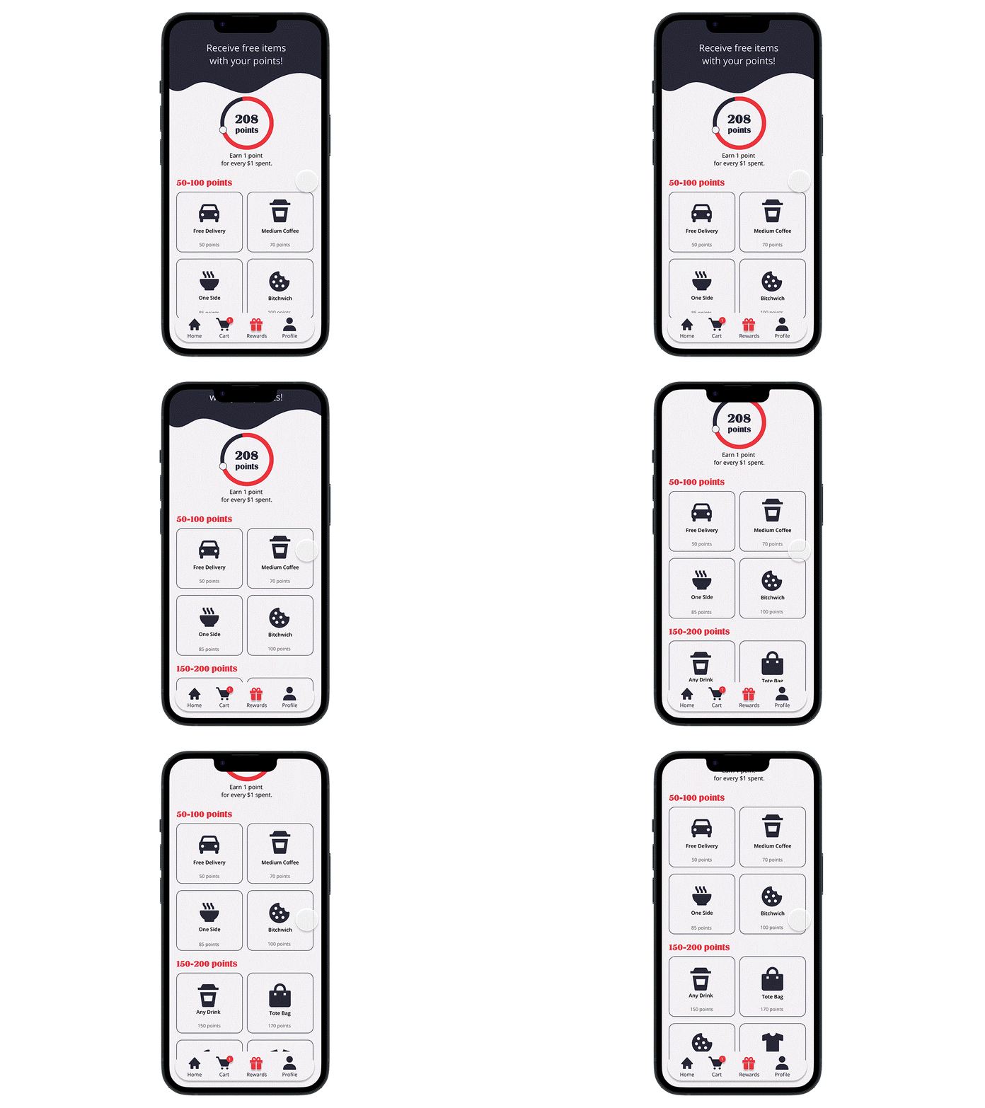
To encourage loyalty with customers, a reward program was included in the app, which allows users to earn points with the money they spend at Biscuit Bitch. The points can be used to earn rewards such as free drinks, food, and even merch.
Rewards
The profile page acts as a home base for the user’s account information, including payment methods, addresses, log-in information, and more.


